Re-purposing the application
For this project, we wanted to incorporate the core functionality of an existing, legacy application within a full-fledged teller system. The legacy solution was originally targeted for a specific audience, payment operations in a commercial environment. Over time, the application evolved into other environments, namely mobile, consumer, and branch back office. While there was a version that could be used by the branch teller, it was not integrated into the other aspects of the teller's applications. To provide a complete solution, the core functionality of the legacy application was incorporated as piece within the whole application. My role was to work with Development and Product Management to re-design the check scanning application portion of the teller application.
Core Functionality
the first step of the process was understanding the core functionality of the check scanning application. I worked with the Product Manager to learn the business requirements of the branch operations and at the same time deconstruct the existing application to determine which functionality should be incorporated and which functionality could be left behind. By reviewing a bank's implementation of our existing product into their own teller system, we came up with a list of MVP features. I then reviewed our existing application to see what was currently available and what required new design.
Modern Implementation
The new application was to be developed in ReactJS, which provided several new UI components we could incorporate into the design. One of these was inline editing. Where the legacy generally required a round-trip to the server to support field validation, the new application could better support inline editing, which is an important aspect of the check scanning application--correcting field recognition errors. This allowed us to reduce the number of screens and allow for a simplified user workflow.
Iterative design
We iterated through the design process several times to review and revise. The first version of the application was little more than a whiteboard sketch of how the application would work.
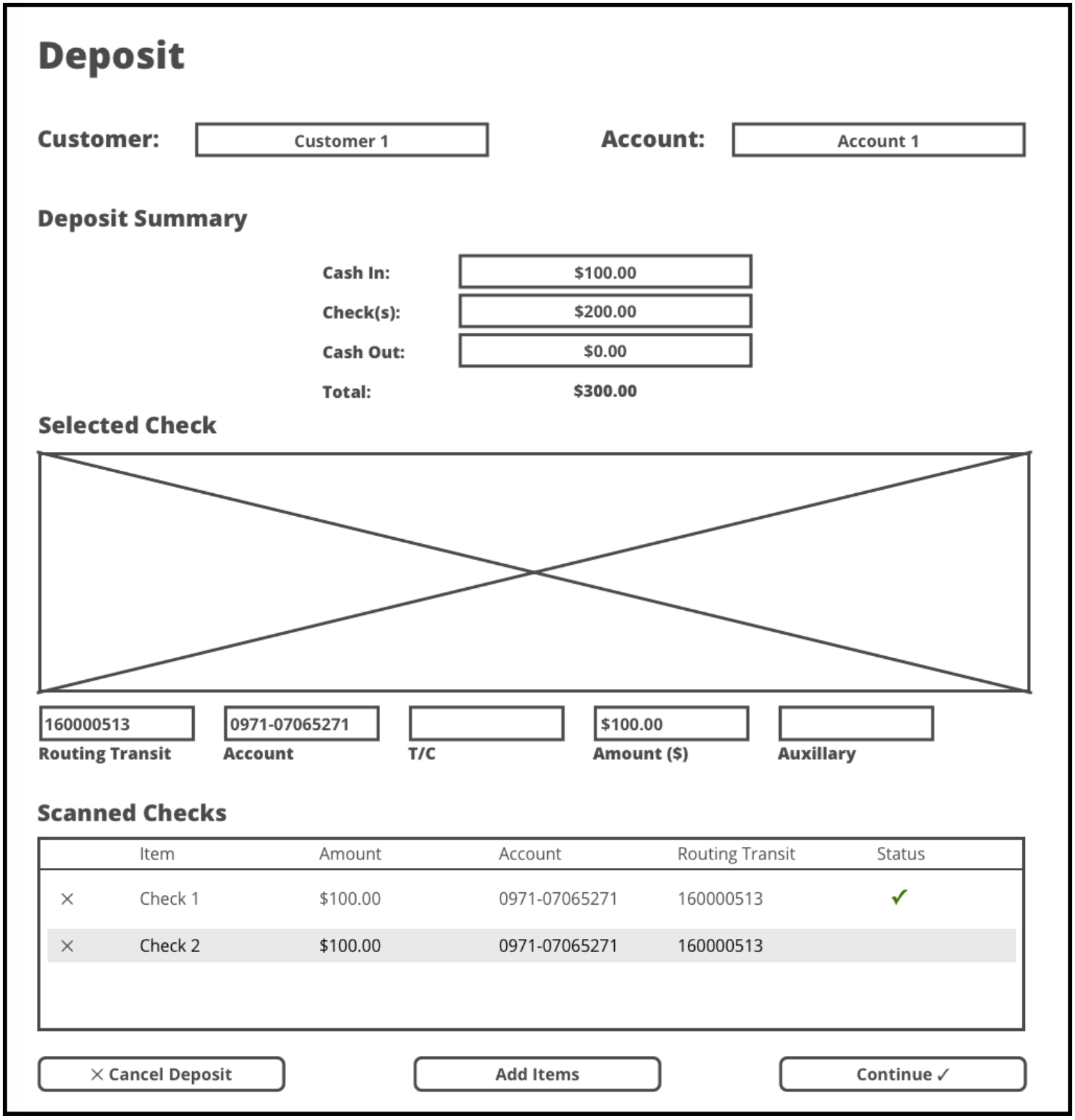
Version 1 was incorporated by a third-party design company who worked with Product Manager, resulting in the following wireframe:
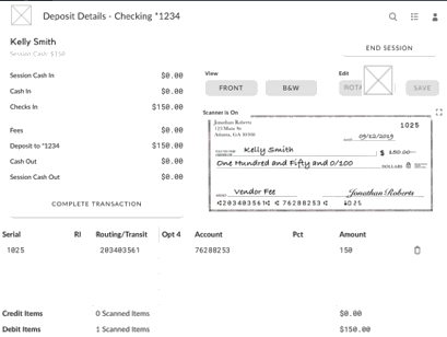
At this point, I took ownership of the design. For my first iteration, I tried to keep the existing layout but knew through experience and prior customer feedback that the image needed to be as large as possible. Currently, the screen space allocated for the image was far too narrow for most business-sized cheques. Going with these dimensions, checks would be reduced in height to be almost unreadable. Version 3 was my first update to the mockup.
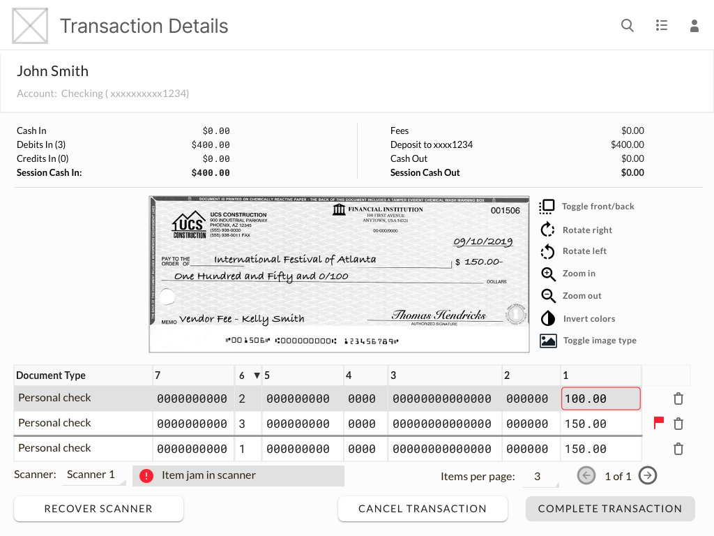
The next iteration, Version 4, considered the requirement of different checks having different fields associated with them, so have one table for all items would require so many rows as to necessitate horizontal scrolling.
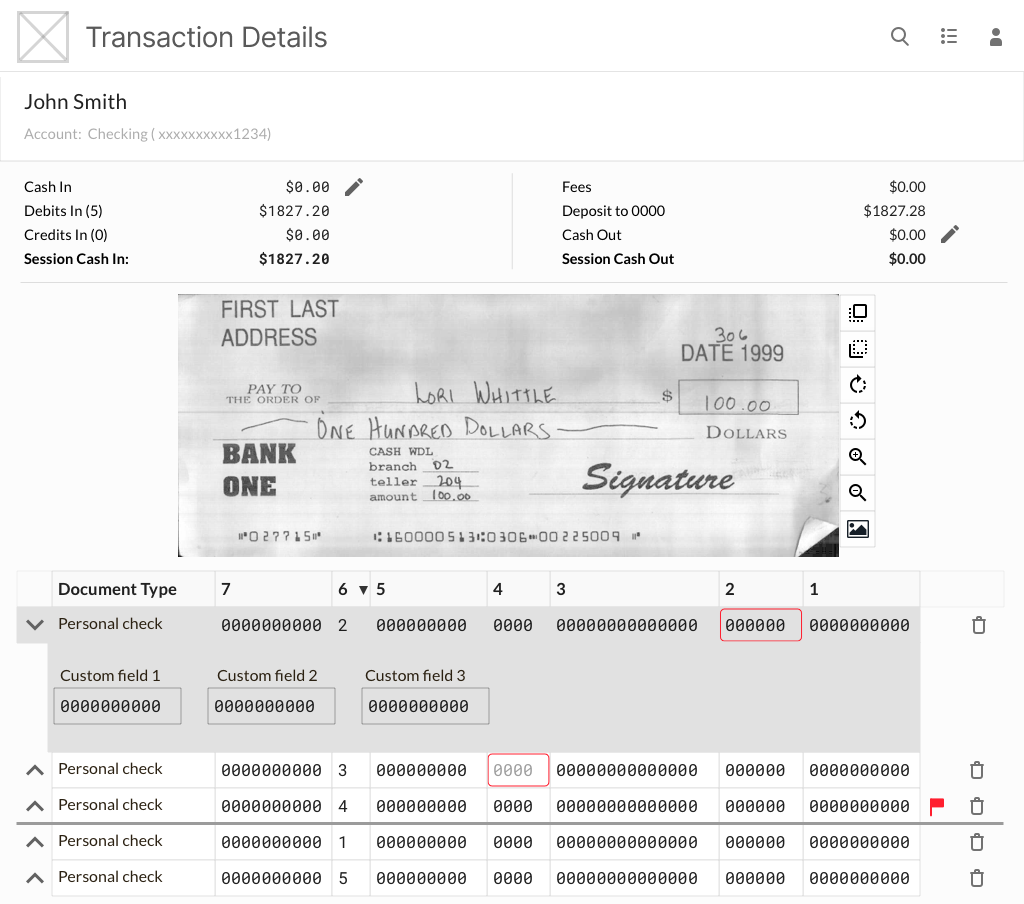
A problem with Version 4 was that its layout would provide space for only a few items in the transaction before the user would need to scroll vertically, which would potentially push the image out of view when the user scrolled down to correct a field in the nth row. To resolve these issues, I redesigned the layout of the screen, which placed the light of items to the right of the image, allowed the associated item fields to appear below the image, and increased the size of the image.
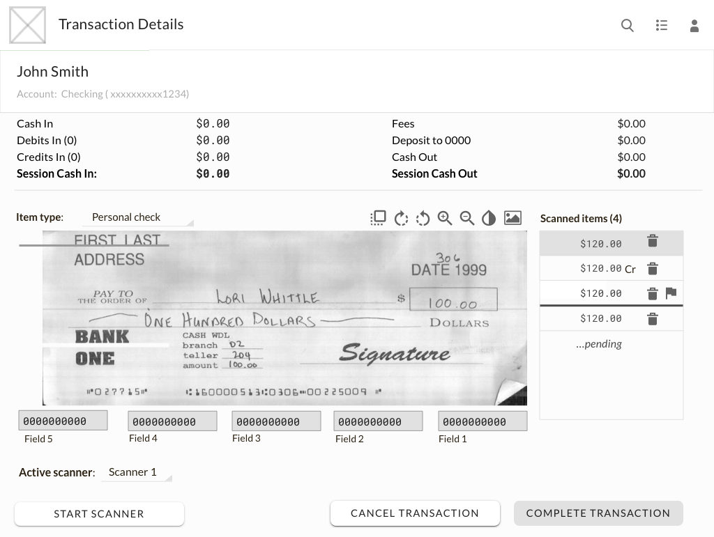
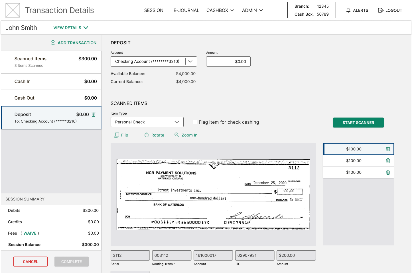
Version 5 became the framework for the screen from which we incorporated additional elements, including screen space for scanner and item errors. During the implementation phase, I worked with developers to provide further explanation to functionality as well as to work through all the issues, corner-cases, and application quirks to ensure that the design would work. In the end the final design looked as follows, Version 6.
Results
Through multiple iterations we were able to take an initial vision and ensure that the design met business requirements, technical constraints, and customer/user requirements.

