

Branding the Application
The two branding projects in this section were enhancements to existing products.
For the first project, we wanted to have a single white-label brand for two mobile plugin libraries. One plugin was ours, the other a third party's. The goal of the project was to have a common brand for both plugins (for both iOS and Android) from which Customers could customize as needed to fit their own brand.
The second project was to simplify application branding for a desktop web application. While larger customers had the resources to update CSS styles themselves, smaller customers and SaaS host administrators would not necessarily have the resources to make these changes. The goal of this project was to provide a simple, straightforward way to brand basic elements of the application.
White Label Brand
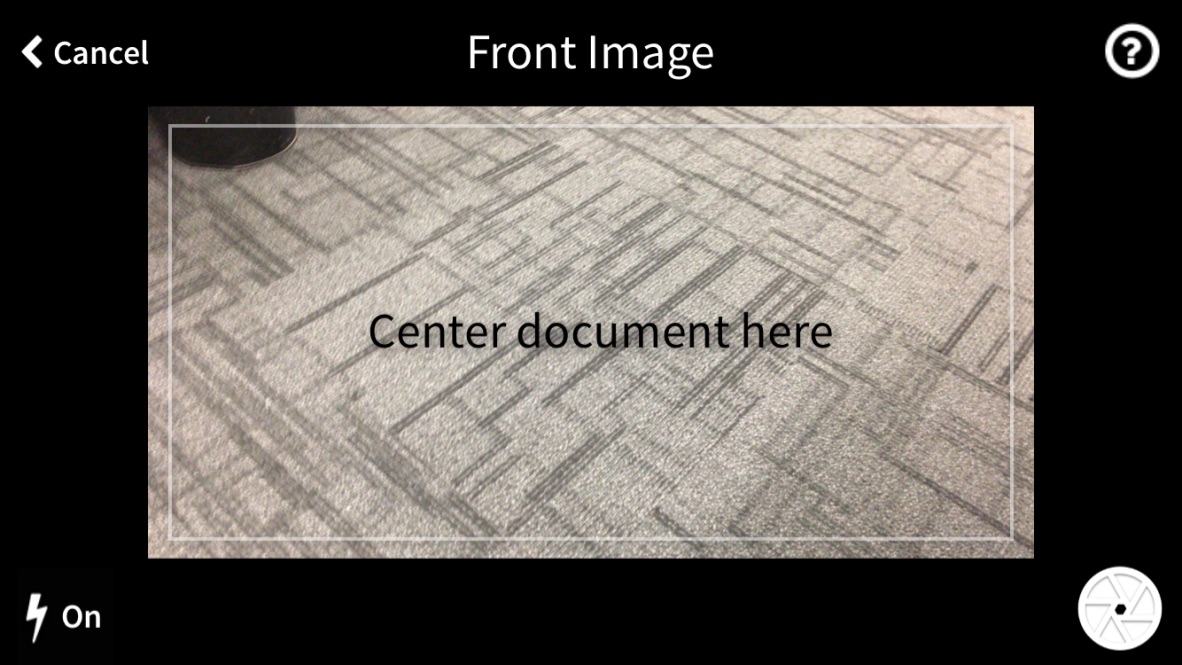
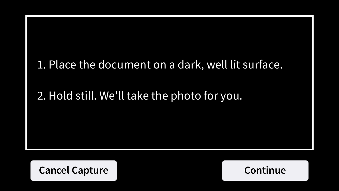
The white label brand was to provide a consistent look for two different mobile device plug-ins. One plug-in was a third party product for taking pictures of a cheques which the other one was an in-house product for taking pictures of non-cheque (e.g., remittance coupons) documents. Although the plug-ins were quite different at a code level, we wanted them to share the same look-and-feel. The business requirement was to create a generic brand that could be re-skinned by individual customers to fit their own needs.
To help communicate the design to internal stakeholders, I developed a mockup in Axure. I chose Axure because it let me demonstrate interactions between parts of the plugin in a way that static wireframes could not, and because I was new to the tool and wanted to challenge myself to learn it.
This first mock-up went through a series of reviews by stakeholders and UX team members to gather feedback. I reviewed their input and made updates to the design before presenting it again. One such feedback was a concern about the visibility of the text when it was displayed overtop light-colored documents. Here, I restyled the text so that it had enough contrast to be visible over dark or light documents. Other comments addressed the amount and clarify of text on the help page. As a result, much of it was discarded for more pointed instructions on how to take clear pictures of cheques.
The following screenshots show some of the improvements made to the mock-up following the iterative reviews.
Easy Branding
The Easy Branding project was to make it easier for non-technical users make branding changes to our desktop web application. I began by researching the kinds of branding carried out most by customers and then prioritizing the most often branded components. To do this, I surveyed several field engineers to understand what their most requested customizations and received a lot of useful feedback, which I turned into a list. I discussed this list with product management and got the go-ahead to begin design. The result was an HTML mockup for a sandbox environment that gave users an opportunity to view and make style changes without impacting the application.
Here is a small interactive sample of that mock-up, which lets users try out stylings for application buttons.