

Incorporating Adaptive and Responsive Design
The goal of the project was to enhance an existing mobile application designed specifically for a phone-sized form factor to also run in a tablet-sized form factor. As part of this project, we also wanted to improve user efficiently using the application so that fewer steps were needed to complete tasks and to reuse as many pages as possible to reduce development time. To achieve this goal, we combined two design approaches: adaptive and responsive. For the parts of the application we wanted to redesign, we reviewed the application flow and identified the pages we could combine or remove. For the parts of the application we wanted to make responsive, we redesigned pages to improve user interaction and aesthetics.
This project had the following design deliverables:
- application flow diagram
- Adaptive redesigns
- Responsive redesigns
Application Flow Diagram
Before deciding how to refactor or replace screens, I developed an application screen flow to show all the individual screens in context. From there, I identified which screens should responsive and which should be adaptive for tablet users.
I then met with our internal stakeholders with the flow diagram and screen redesigns to discuss which ones could be handled through adaptive design and which could be made responsive. As a result of this activity, we determined about 1/3 of the application pages were new and the remaining 2/3 needed to incorporate responsive design.
Adaptive Redesign
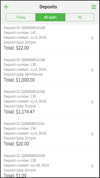
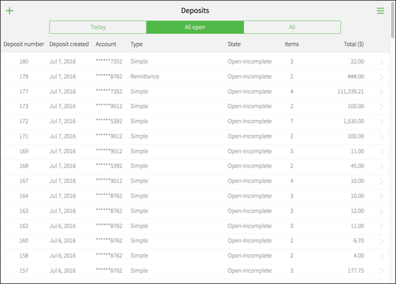
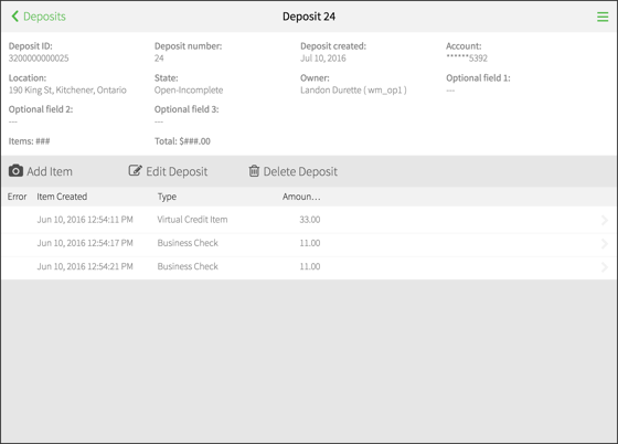
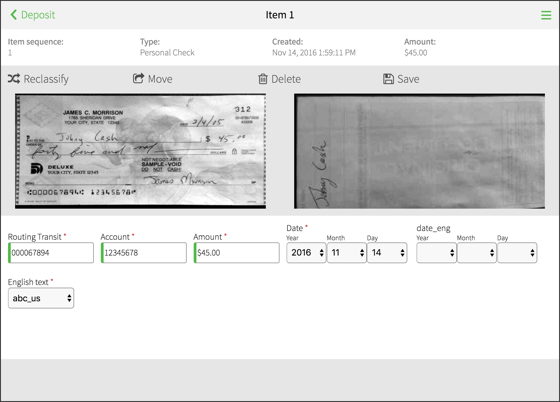
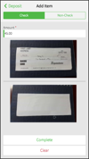
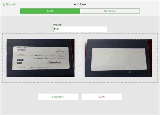
As part of the screen flow review, I identified screen interactions that were cumbersome or reduced user efficiency and then sketched redesigns to address them. For example, to see the list of items belonging to a deposit, users needed to select a deposit from the Deposit List page, then click View Items to reach the list of items for the deposit. Although only one extra step (a click and then a screen load), this navigation route is a primary task and performed frequently. In this example, I designed a combined, deposit + item page which would provide the same functionality with less navigation and reduced page load time. After some review with the Development team, we settled on a single design for Deposit View and Item View pages.
From the white-board designs, I went ahead and created HTML and CSS prototypes to show the page transition from and to these new pages. After presenting these new pages/flows with the internal stakeholders, I made design updates to improve consistency across the pages. Once finished, the mock-ups were linked to JIRA stories so that Engineering could begin work on them. During this process, I assisted develops with the more complication CSS layout changes.


Responsive CSS
For the application screens identified for responsive design, I made some quick mock-ups in HTML + CSS to show how they would look on different screen resolutions. After a few iterations and reviews by internal stakeholders, I took the lead on creating the CSS changes to support the new designs. One of the business requirements was to ensure that existing customer deployments would not be affected by the retrofitted adaptive/responsive pages. To meet this, I organized all the responsive changes into a new SCSS file (_responsive.scss) that left existing pages with their current HTML, class names, and styles. This new responsive file contained the new media queries so that our application responded correctly to tablets of varying size in landscape and portrait orientations.
One potential issue with this strategy was the added complexity of the customization process. With our help, customers brand the application to meet their organization's guidelines. Retrofitting responsive CSS media queries without an overhaul of existing class names meant some loss of semantic meaning of the existing tags. After some discussion with Product Management, we decided that this trade-off was acceptable if we could meet the aggressive deadline to get this product to market.
Once the responsive CSS changes were completed, we reviewed the new layouts with stakeholders and incorporated their feedback into a quick, second iteration. These changes were signed off and the pages were handed off for testing.

Results
Both the newly designed pages (i.e., the adaptive part of the project) and the pages designed to be responsive were completed and the project was released on time. Our team was new with mobile development and we encountered several issues along the way, particularly around popovers and scrolling. However, the design proved solid and the new tablet pages were received well both internally by the support organization as well as the external audience.