Securing the Application
This project had two objectives. The first was to enhance the security of an existing mobile application to meet the customer's security requirements. The second objective was to carry over these security enhancements to an existing desktop web application so that both applications shared the same authentication model. The enhancements included:
- the forgotten password scenario
- setting up security challenge questions
- answering challenge questions
- allowing for and enforcing a customizable set of password rules
Although the mobile solution was targeted at a specific customer, the design needed to flexible and configurable enough to work in the general product which was used by a variety of different customers.
Mobile Application
The first phase of the project was to enhance the mobile application so that it would operate in the customer's existing security system. We researched at a high level how the customer currently handled authentication, what their back-end systems required, and how our mobile application would interact with it. We reviewed the UI for their other mobile applications to understand the task flow. In one case, we suggested a design improvement—providing immediate password rule compliance as users type new passwords—to the UI for changing passwords, which the customer agreed was an improvement to the user experience. The following assets were developed as part of the design:
- flow diagram
- UI wireframes
I developed the flow diagram by working through various scenarios required by the customer as well as additional ones needed by a general audience. Some of these scenarios included:
- the forgotten password flow
- setting up challenge questions with grace period
- setting up challenge questions with no grace period
- new user sign-in
- resetting an existing user's password
By working through these and other scenarios, I began mapping out interactions between the user, screens, and system. Working with the Development team, I drafted, reviewed, and updated the flow until we had a model of the application. The result was the following flow diagram:
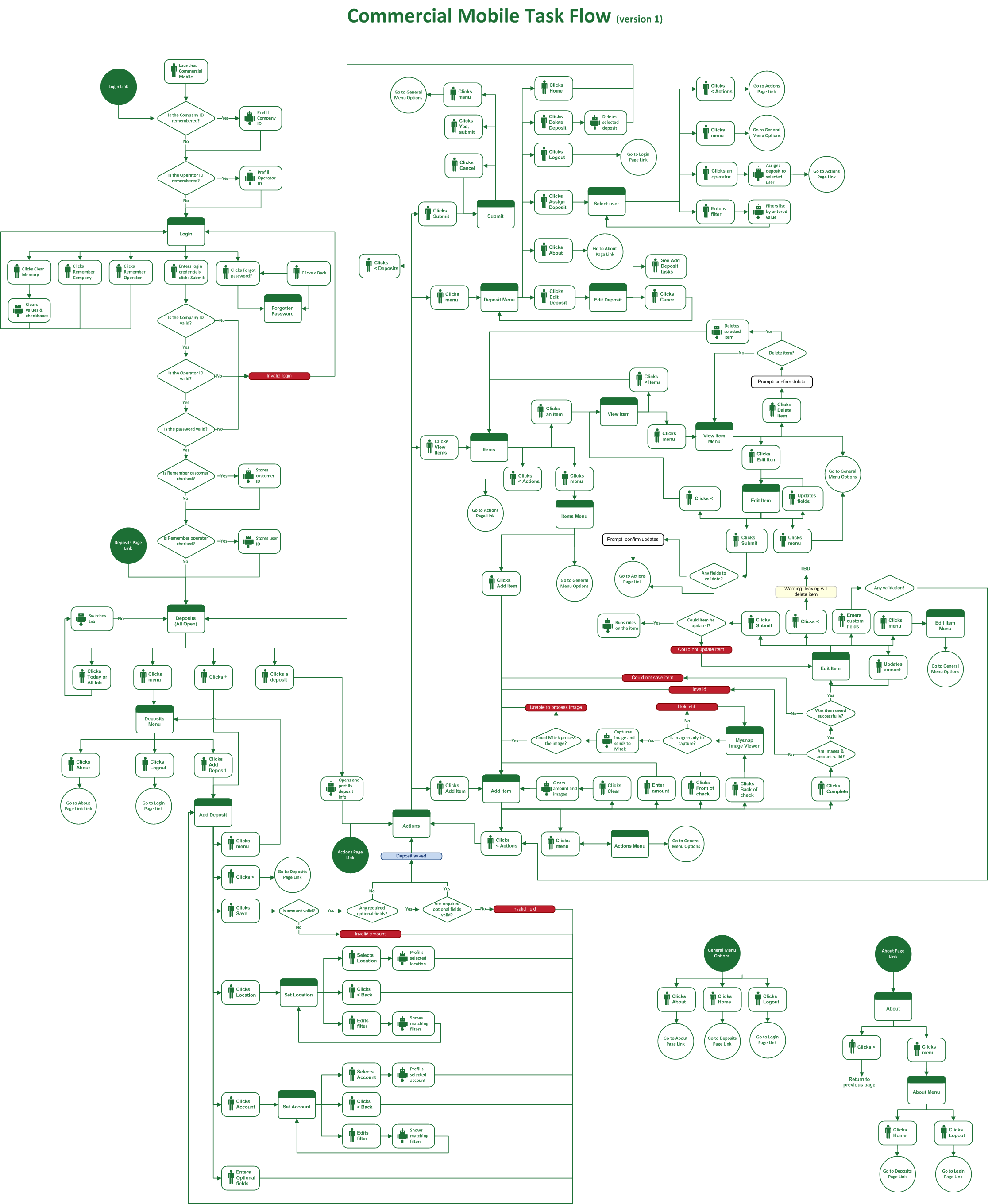
Around the same time as I was working on the flow diagram, I also began constructing wireframes of the new and updated screens. As with any project, some of changes resulted in competing designs. To resolve design conflicts, we met as a team to understand the pros and cons of each one before deciding which approach to take. In some cases, we held design reviews with the customer to better understand their needs and requirements.
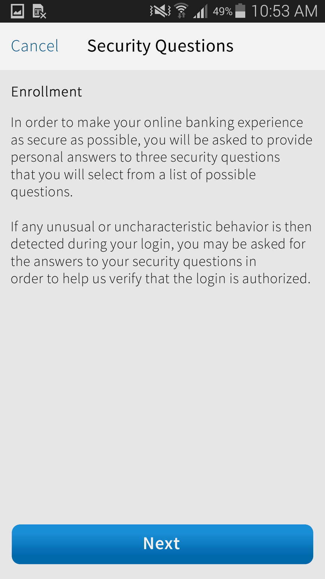
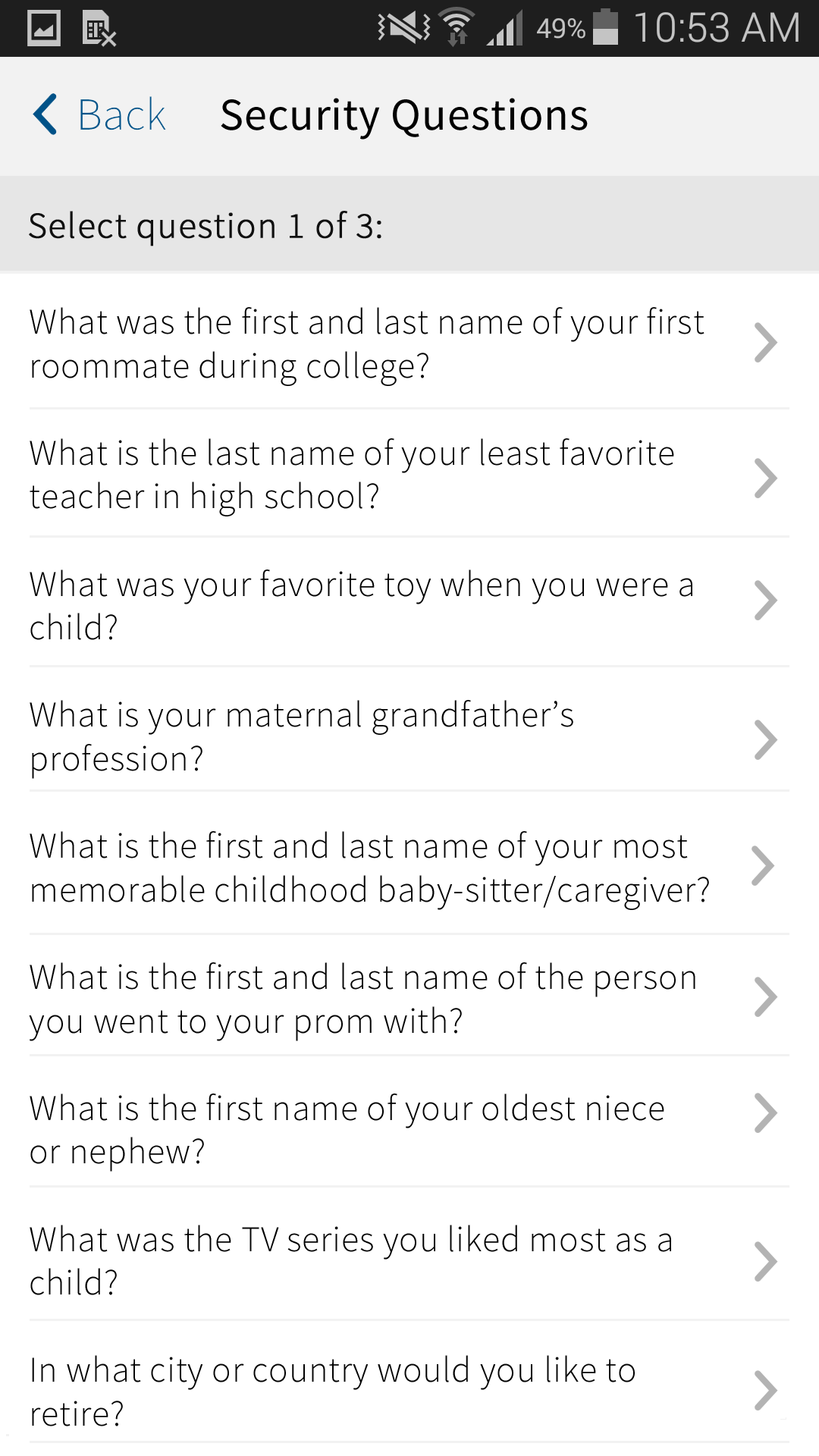
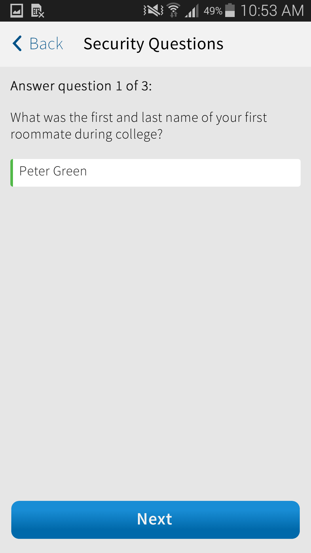
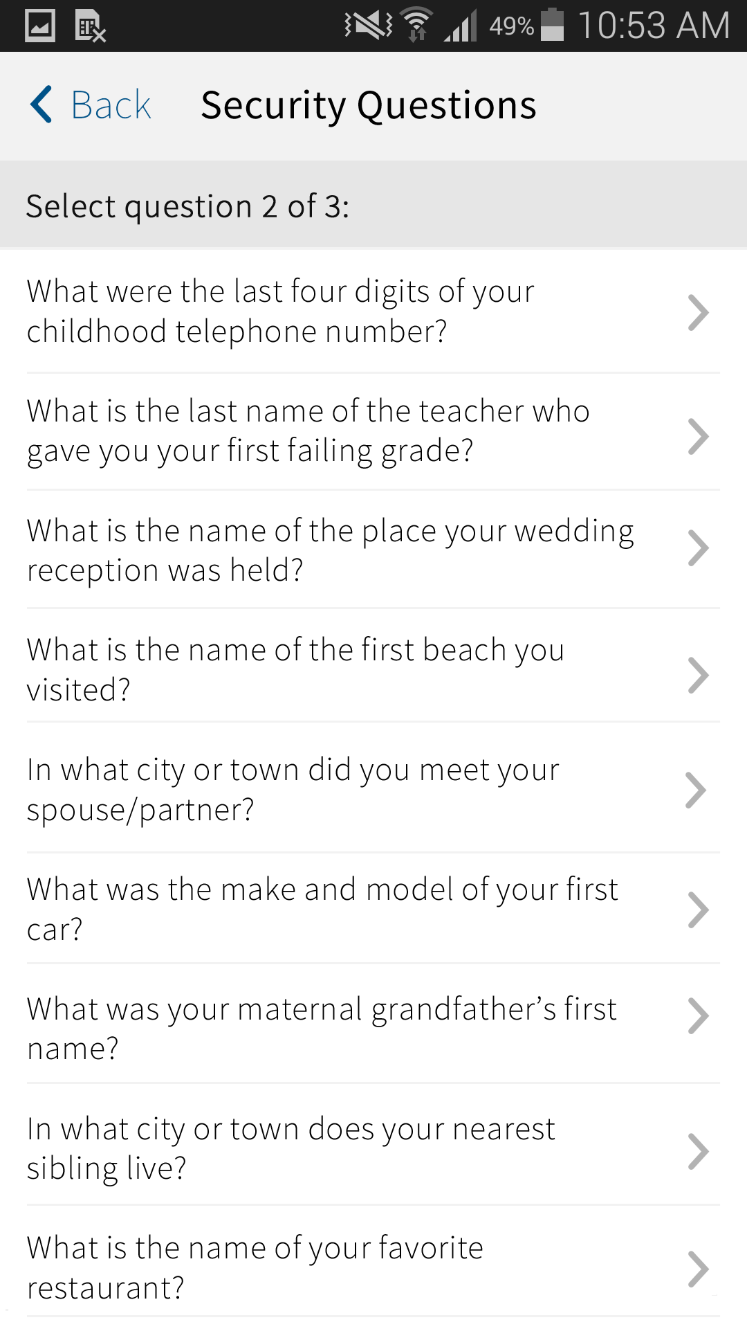
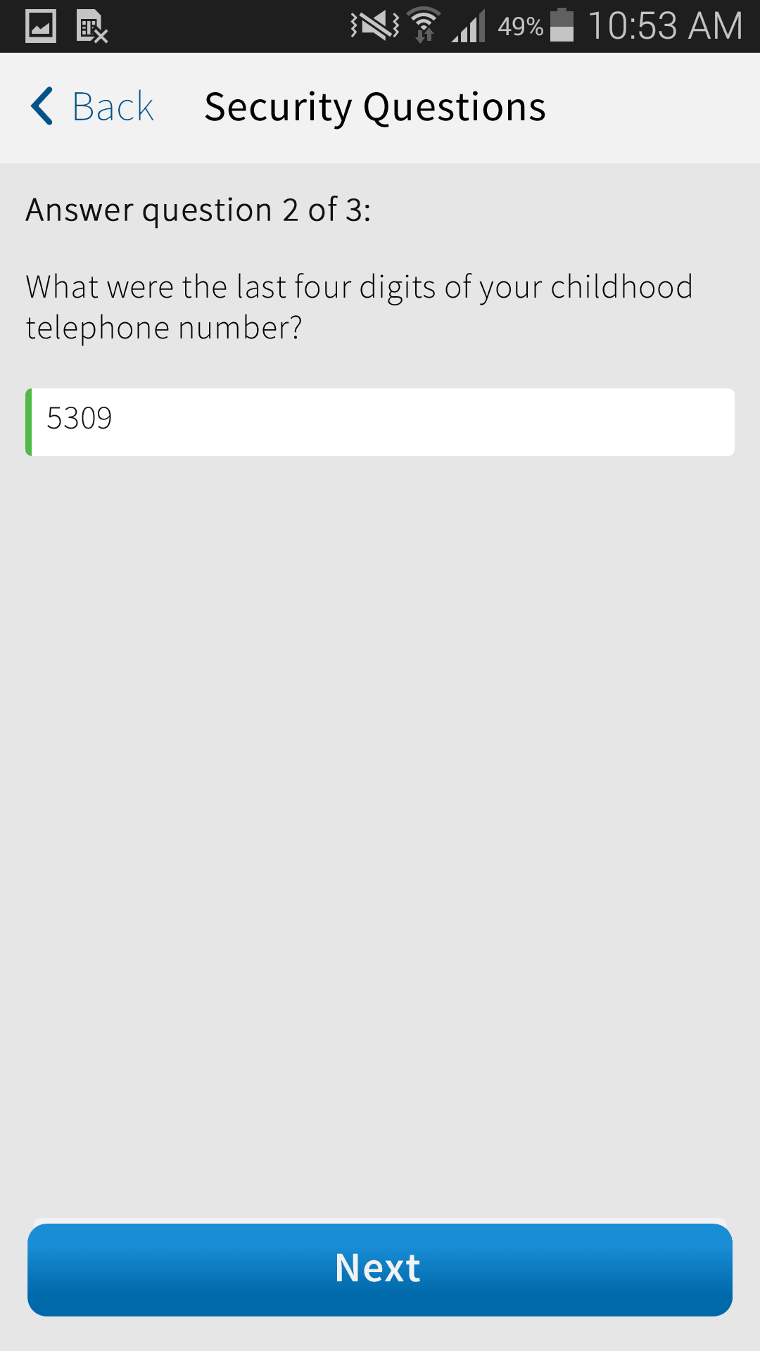
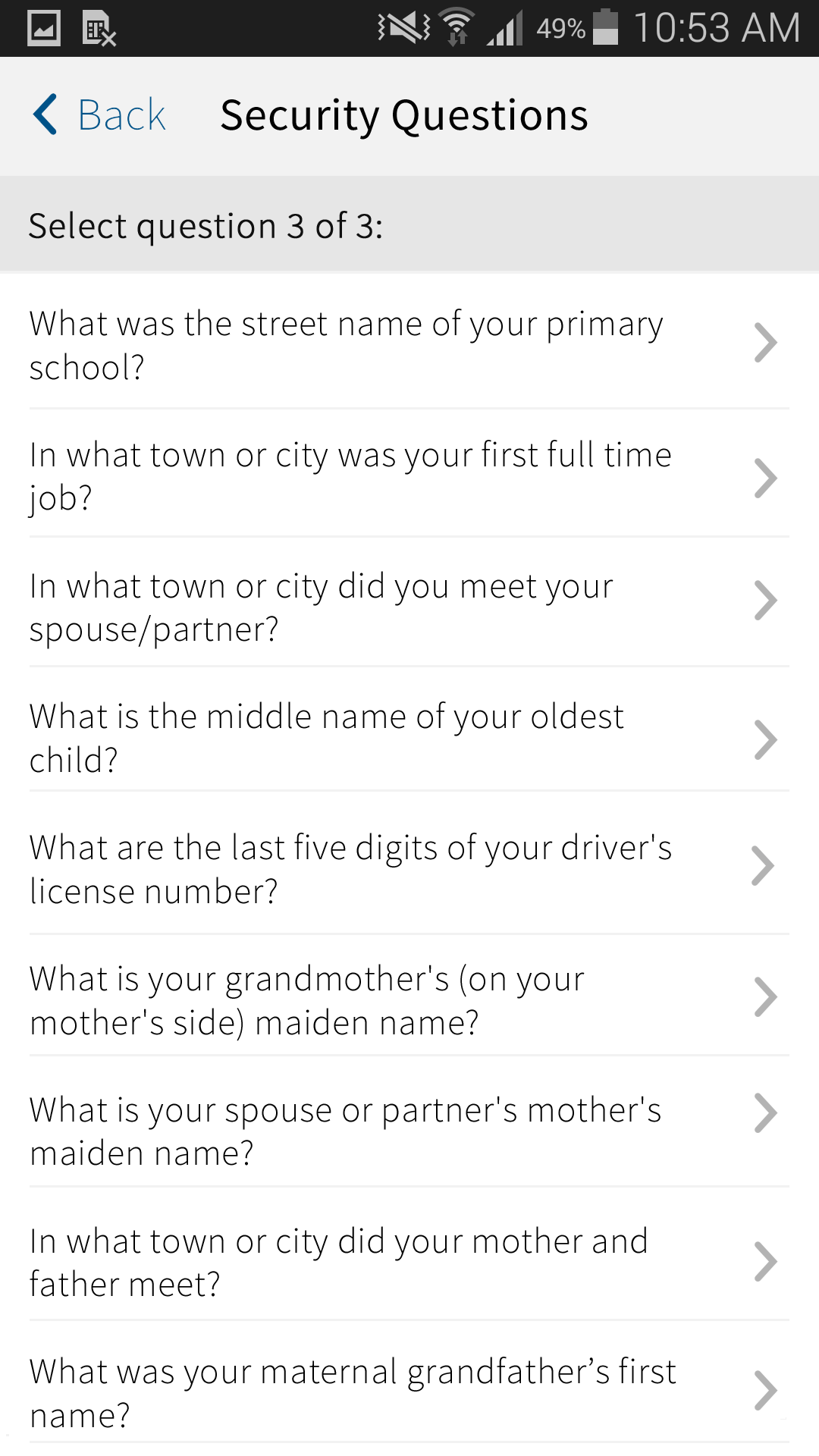
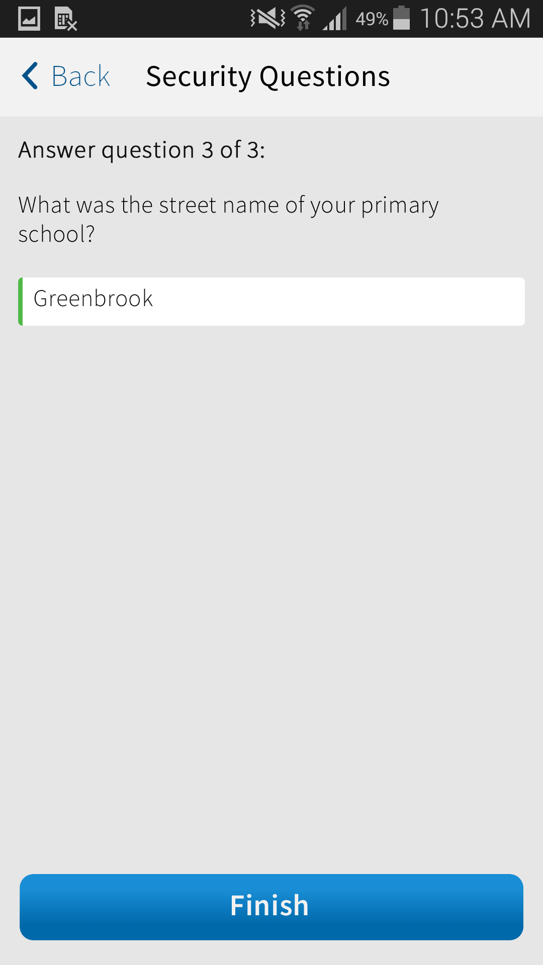
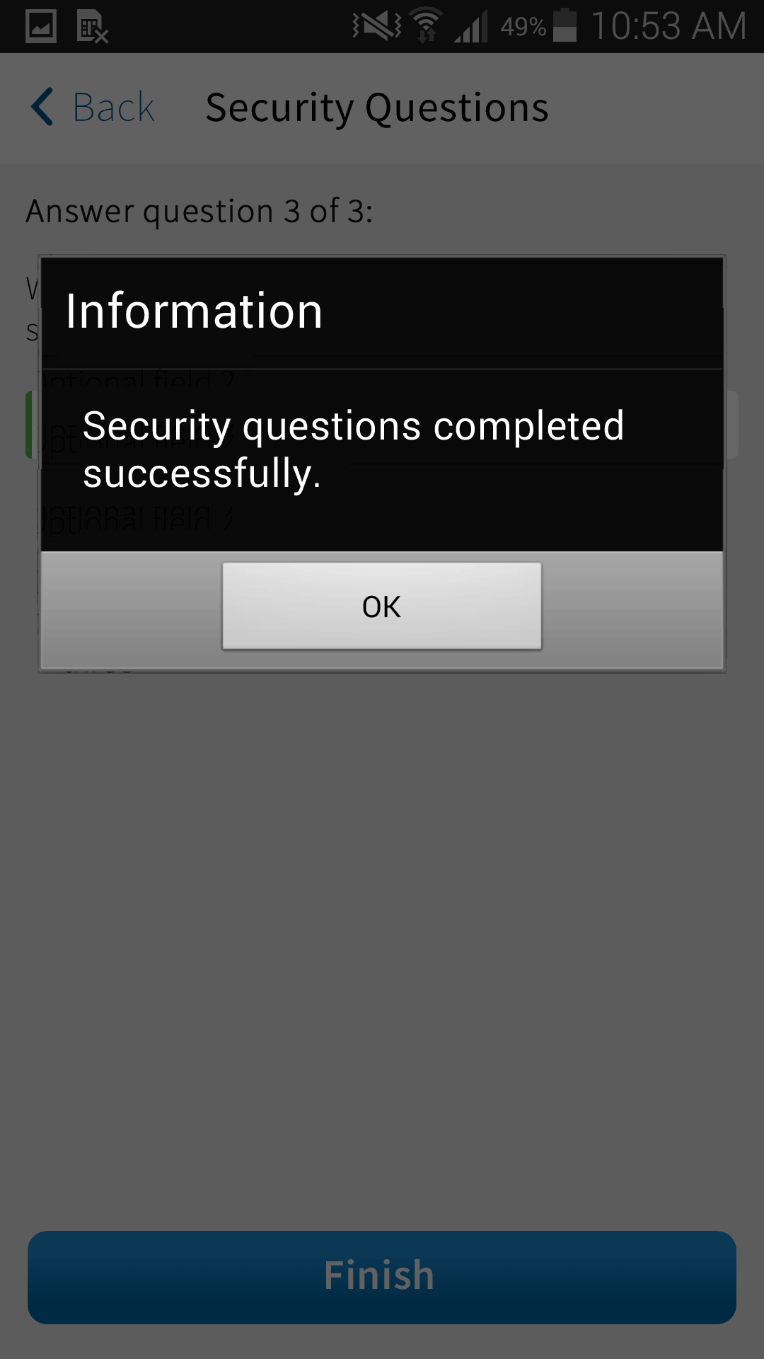
An example of a feature with competing designs was in the presentation of the challenge questions to the user. One approach was to display the configured number of security questions in dropdowns on a single screen, which another design was to adapt a wizard approach where each the user selected a question on one screen and then provided the answer on a separate screen.
In the end, we settled on the latter approach because that presentation was more consistent with other parts of the application and would provide more flexibility as to the number of question/answers needed and at what part of the system they were submitted to the authentication system. The resulting wireframes were as follows:
Once we had a set of wireframes, I assembled them in a PowerPoint to present to the customer. This presentation helped them understand not only how the new and update screens looked and behaved but also to ascertain how they would perform with their back-end authentication system. While the customer required some changes, they were pleased with result.
Desktop Web Application
Like the mobile application, the desktop version of the application required the same flexibility as well as needing to follow a consistent approach as the mobile application and account for the platform differences.
Again, I produced the following artifacts:
- application flow diagram
- application UI wireframes
I followed a similar approach to creating the desktop web flow to understand and communicate the user and system touchpoints. Fortunately, many of the same design decisions were already answered with the mobile version, so this made the diagramming the desktop web flow easier. The resulting flow is as follows:
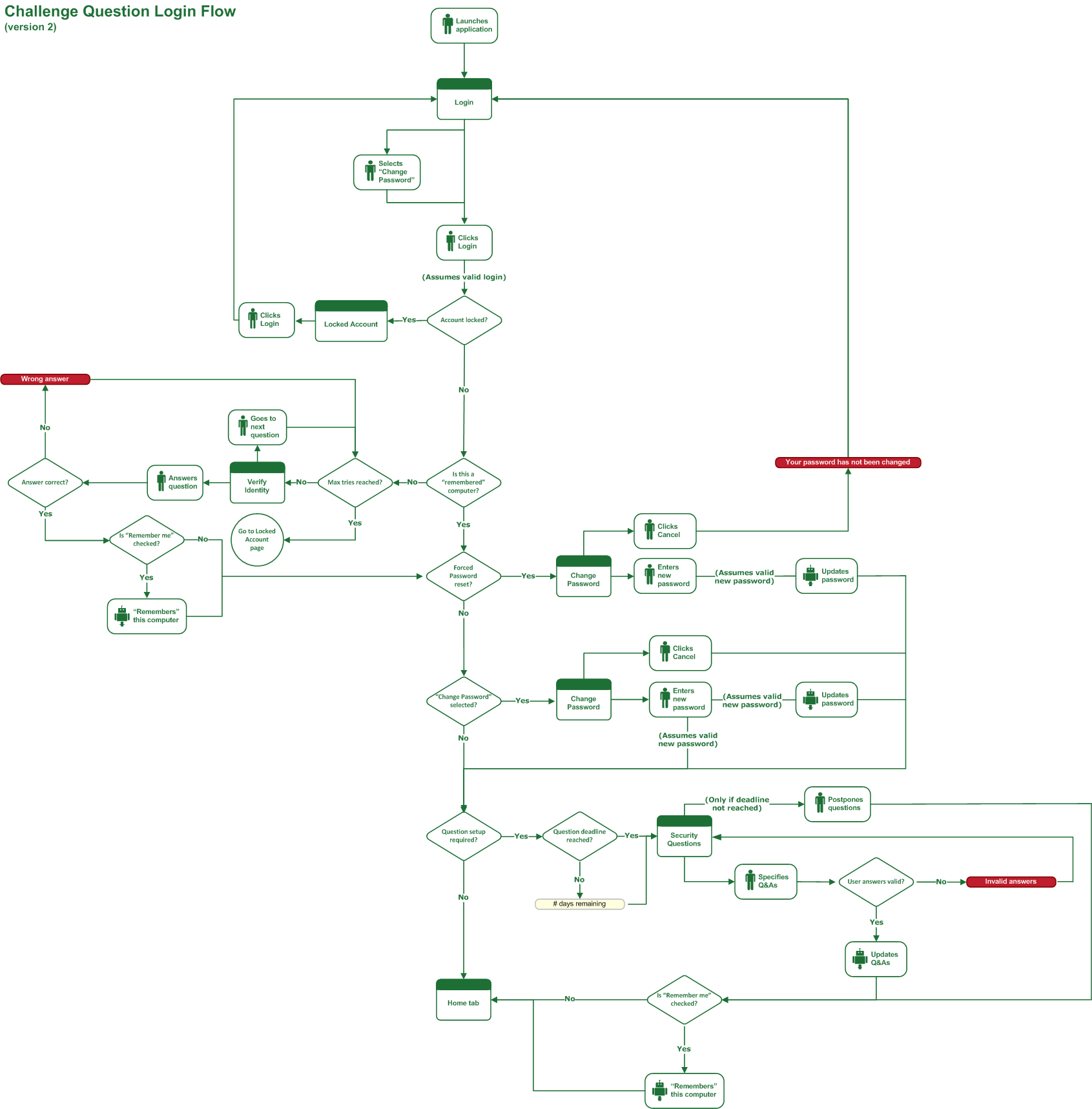
For the UI wireframes I made flat HTML file versions of the existing application screens. I built up the design using HTML and CSS and added JQuery functions to simulated page flow informed by the flow diagram. These mock-ups were as follows:
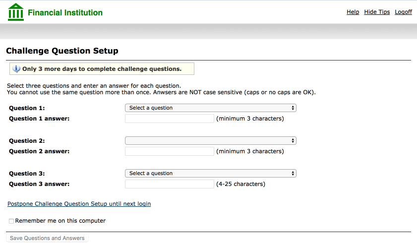
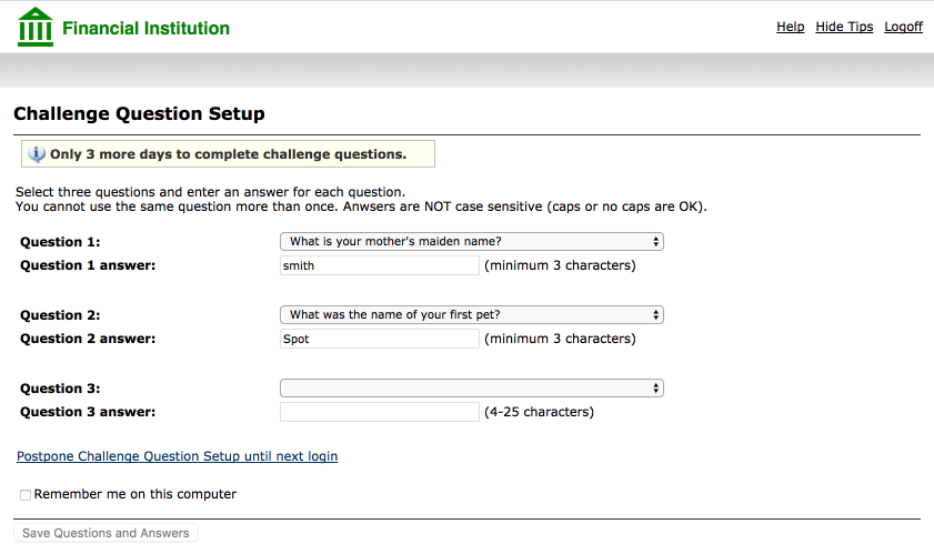
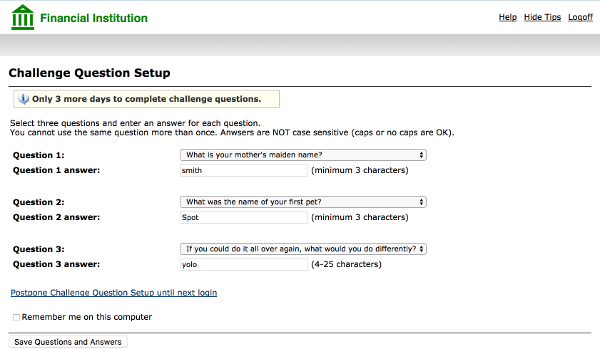
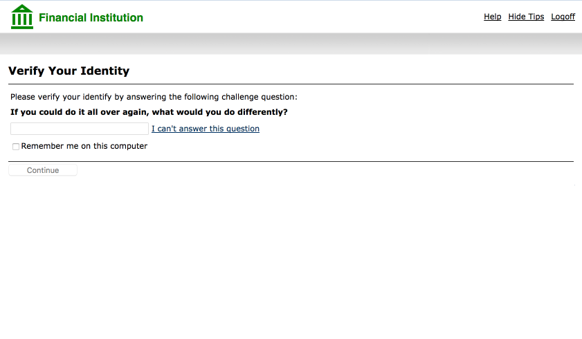
Once completed, I presented the mock-ups to stakeholders. After some discussion and minor changes, the mock-ups were approved and linked to JIRA stories to begin development.


